← All case studies
[ CASE STUDY · EPIC CHURCH ]

MakeRoom.

A sermon series, a capital campaign and the first permanent home for a church that has set up and torn down every Sunday for nine years. One system, five rounds, built in-house.

Client
Epic Church · Palm Coast, FL
Scope
Strategy · identity · series graphic · merch · song · bumper · motion
Format
Screen kit · print · 16:9 film · layered Canva kit
Timeline
Aug – Sept 2026
Series
Sept 27 · Oct 4 · Oct 11
3
Sundays. The series window; the campaign closes the last gap to break ground.
5
Rounds, from mood board to a layered kit the client opens in Canva
333
Chairs, landing one at a time in the seat-fan logo build
1:10
The bumper, cut to a 98 BPM grid with the drop at 0:55
[ THE CHALLENGE ]

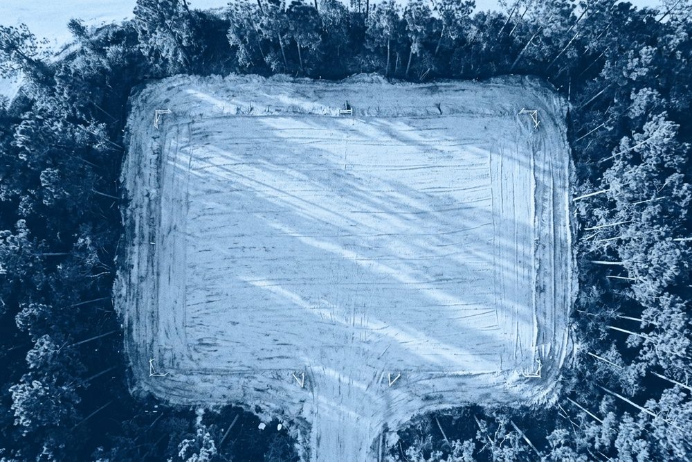
The land is paid for. The pad is graded.

Epic Church has been portable since its first Sunday. The land in Palm Coast is owned outright, cleared, graded to elevation, every dollar of it paid in cash. What is left is the distance between a church that lives on carts and a church that has a front door. Phase 01: an auditorium, kids environments, a café, multipurpose rooms. A three-week series to close the gap.

“The campaign is about people, not the building. No steeples, no crosses, no hard hats.”

Blue is the drawing. Colour is the people.

01CAMPAIGN CREATION // STRATEGY

Three starting ideas. One system, not a contest.

The brief arrived with three thoughts: the silhouette of the new building, a room full of people, and a typographic play on the words themselves. Two previous campaigns, Imagine and #ForFlagler, were off the table. Tone: inspiring, bold, visionary. Direction: bold typography with a blueprint aesthetic, architect meets engineer. Budget range $10K, three weeks, everything produced in-house.

Instead of pitching the three ideas against each other, we treated them as one system: a typographic mark that is itself a measurement, blueprint line-art as the texture, and the emotional thread of the people who are not in the room yet. Then we stress-tested that system against two deliberate opposites before committing.
PositioningMood boardThree directionsSermon arcFoundry pipelineApproval-gated
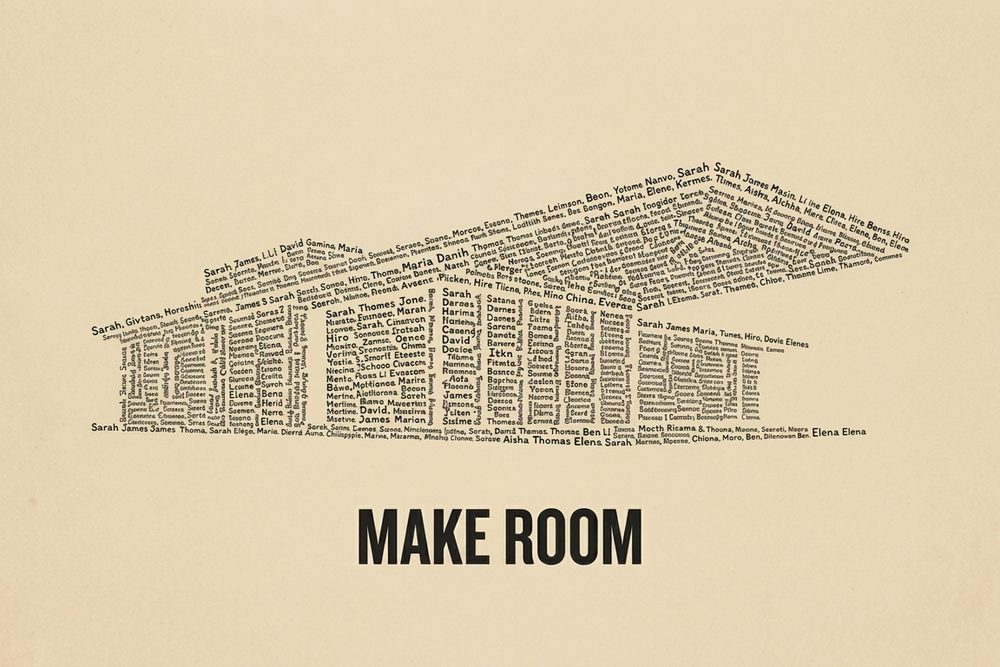
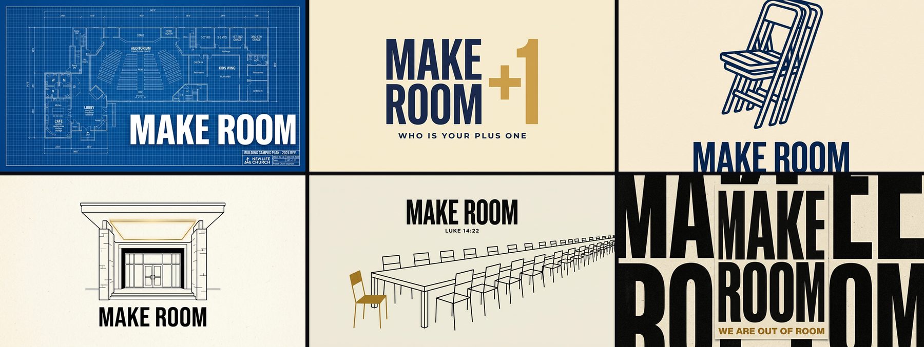
Six of the first-round concept frames: blueprint poster, plus-one, folding chair icon, portico line drawing, long table, type poster
Round zero, the afternoon before the mood board: ten visual concepts generated straight from the brief and the client call, from a blueprint poster to a plus-one tee, so the three directions were written against pictures and not adjectives.
[ THE STRATEGIC FORK ]

We built the opposite twice, on purpose.

A blueprint campaign raises capacity by proving momentum. It is also the national default, and it argues from the building's side. So before locking it we wrote two full counter-directions, each with its own mechanic, palette, type and film, so the client was choosing between real strategies and not between colourways.
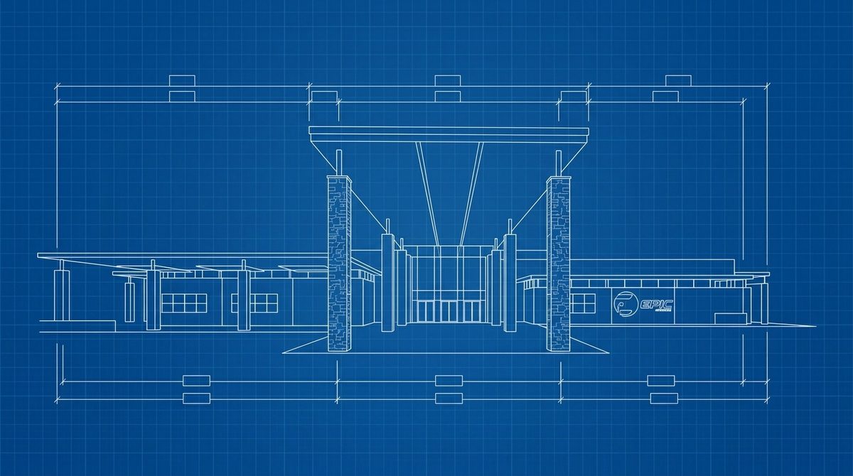
Phase 01 front elevation drawn as a blueprint
Direction A
Blueprint

Raises capacity by proving momentum. Land owned, site cleared, pad graded, distance to close. Institutional, blue, the dimension line as a progress meter.

✓ Chosen · developed through five rounds
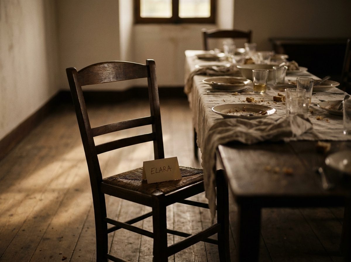
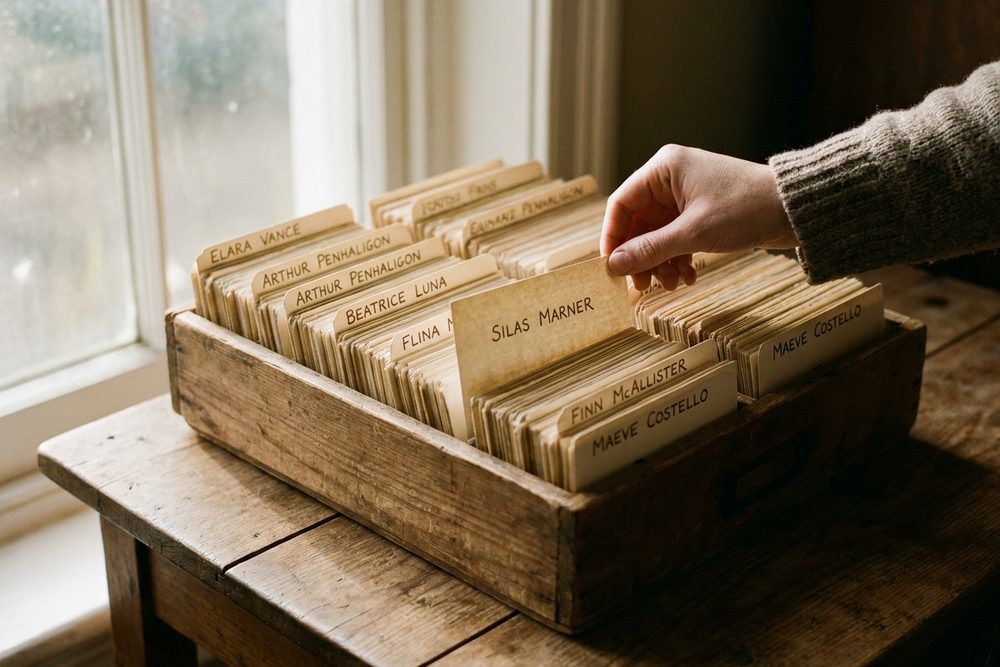
One wooden chair with a name card at a long table
Direction B
One More Chair

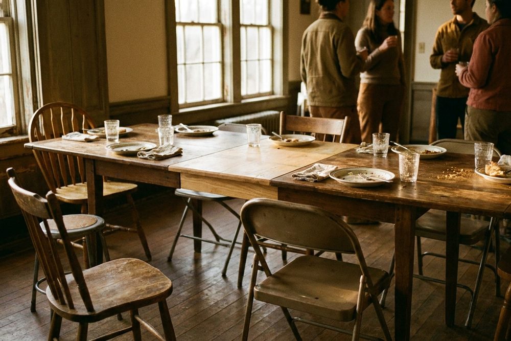
Raises participation by making it personal, in three languages. A white plastic chair, a celosía wall of names, a comida in the parking lot. Blue banned. The site never appears.

Explored · held for the congregation
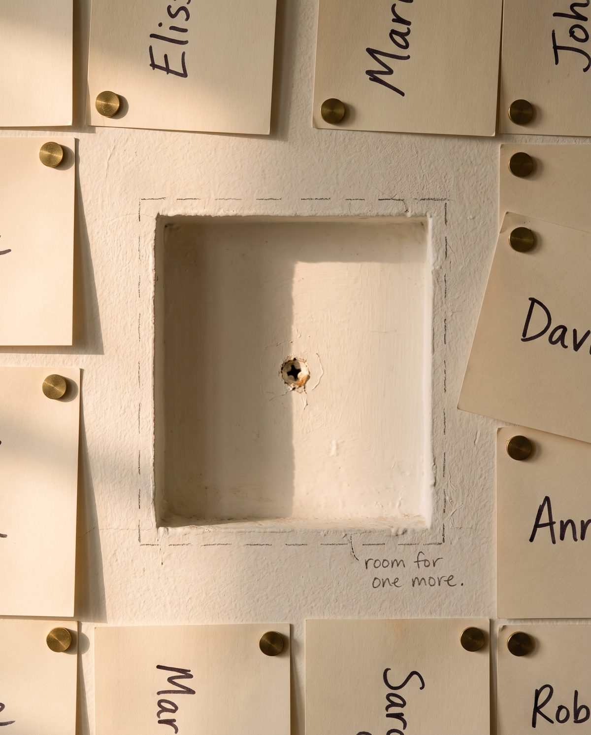
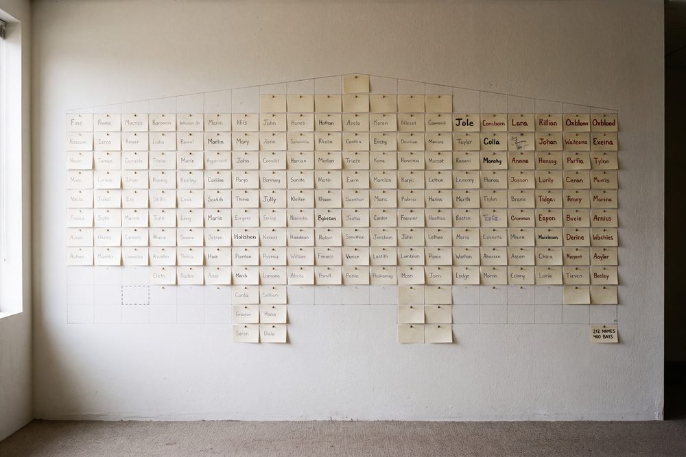
A wall of name cards with one bay left open, labelled room for one more
Direction C
Written In

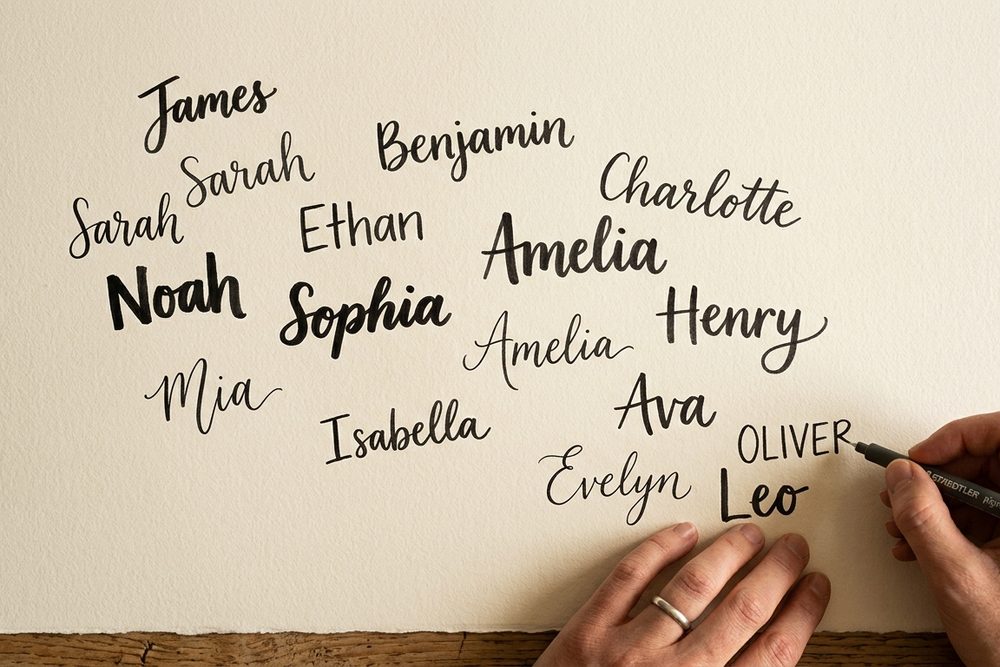
Names as elevation. One name on one card; pull back and there are four hundred, and the names become a wall. No thermometer. One bay always left open.

Explored · 21 sheets + 12-slide deck
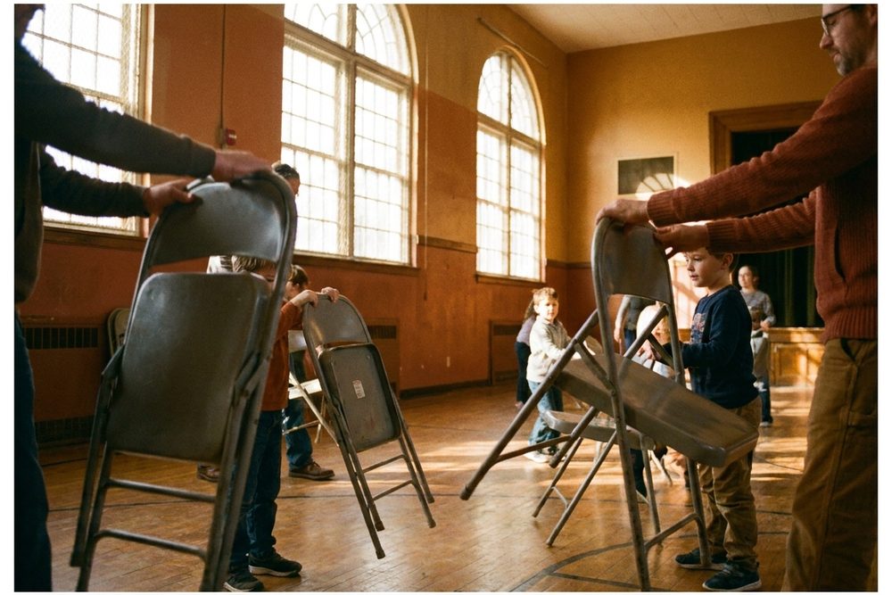
Frames from the two directions that were set aside. Direction B, Portra and folding chairs; Direction C, one hand and four hundred names. Both were built out far enough to be chosen.
[ THE SERIES ]

Three weeks, three texts, one ask.

Every surface in the campaign points at the same three Sundays. The language stays personal: make room for your family, your friends, your people.

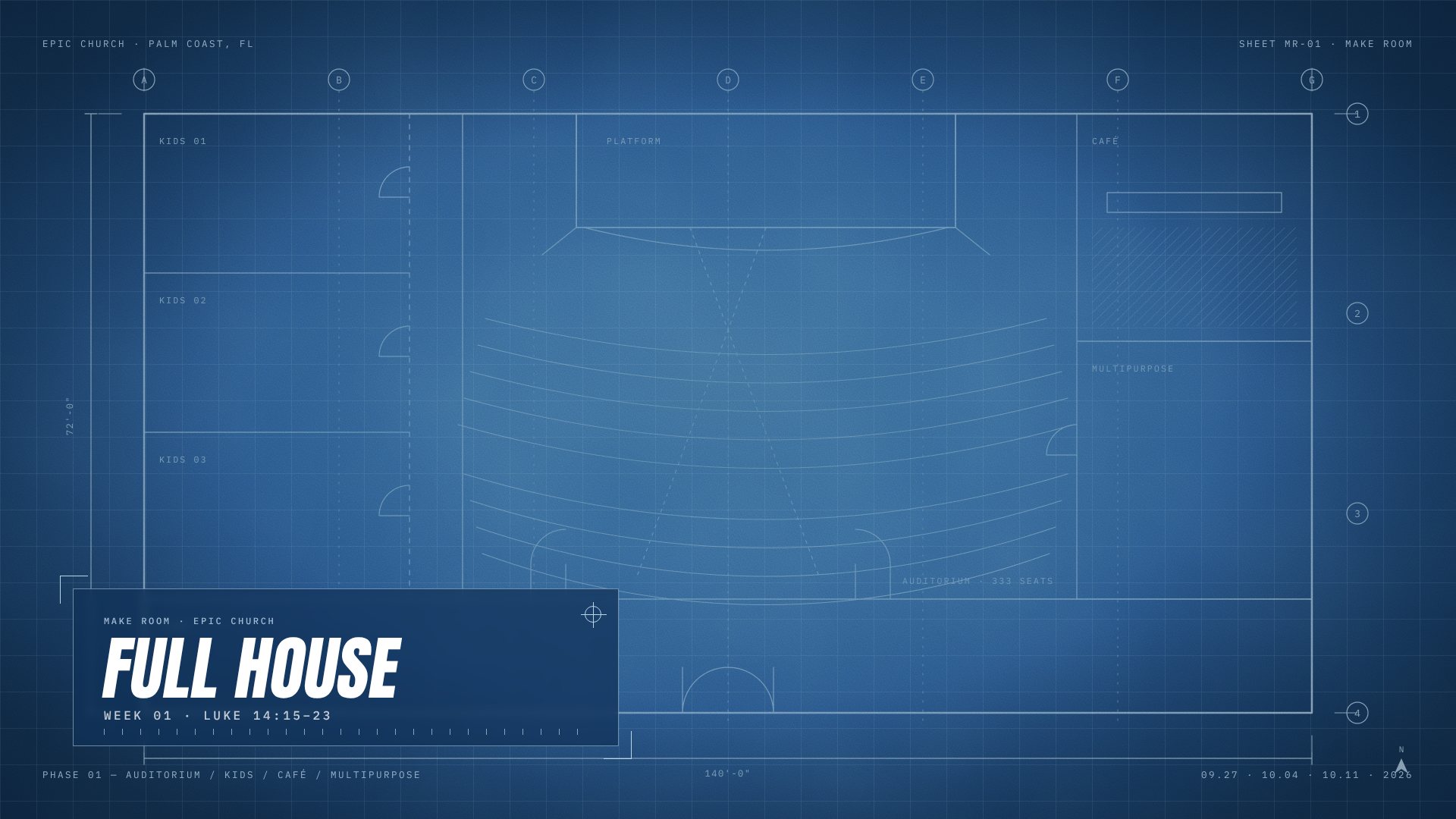
Week 01 · 09.27.26
Full
House
LUKE 14:15–23

The banquet is ready and the master sends the servant back out anyway. There is room still.

Week 02 · 10.04.26
Build
Faith
NEHEMIAH

The wall went up because everyone took a section. Not one hero.

Week 03 · 10.11.26
What
You Have
EXODUS 35 · JOHN 6

Israel brought what was already in their hands. A boy brought lunch. Equal sacrifice, not equal gifts.
03THE SERIES GRAPHIC // ROUNDS 2–5

“Overall we love concept 1. This really looks and feels like EPIC.”

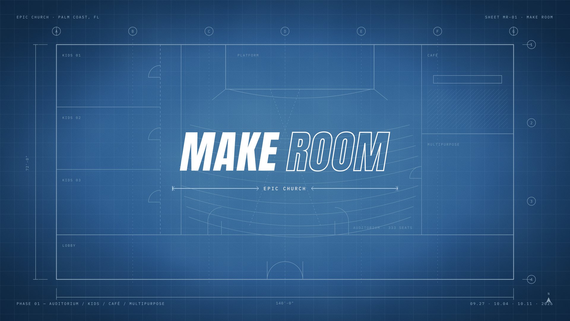
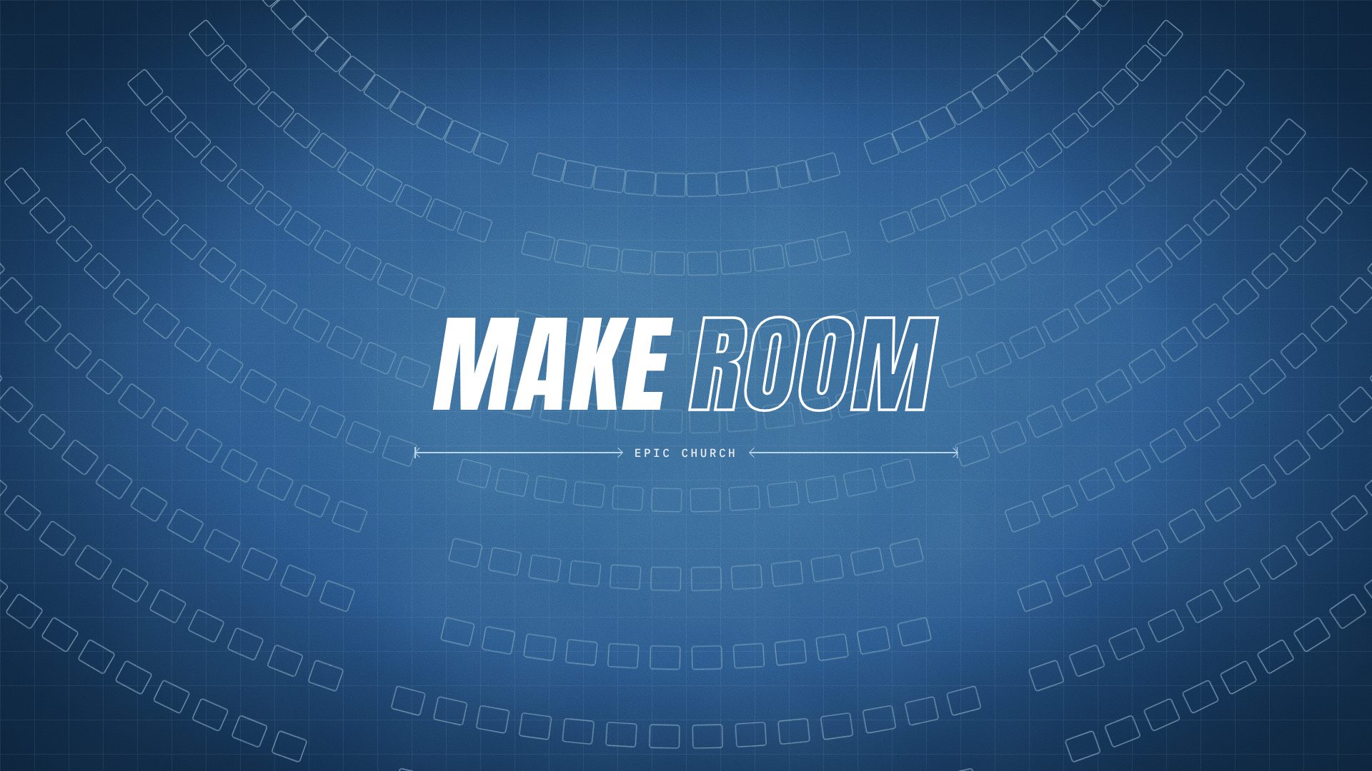
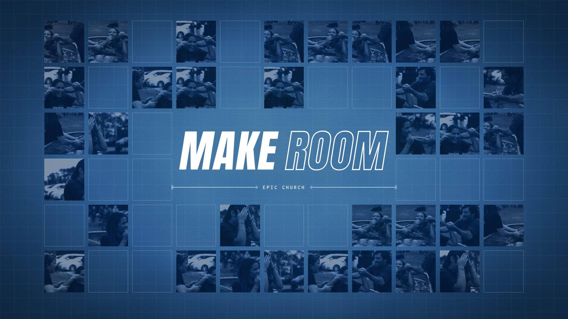
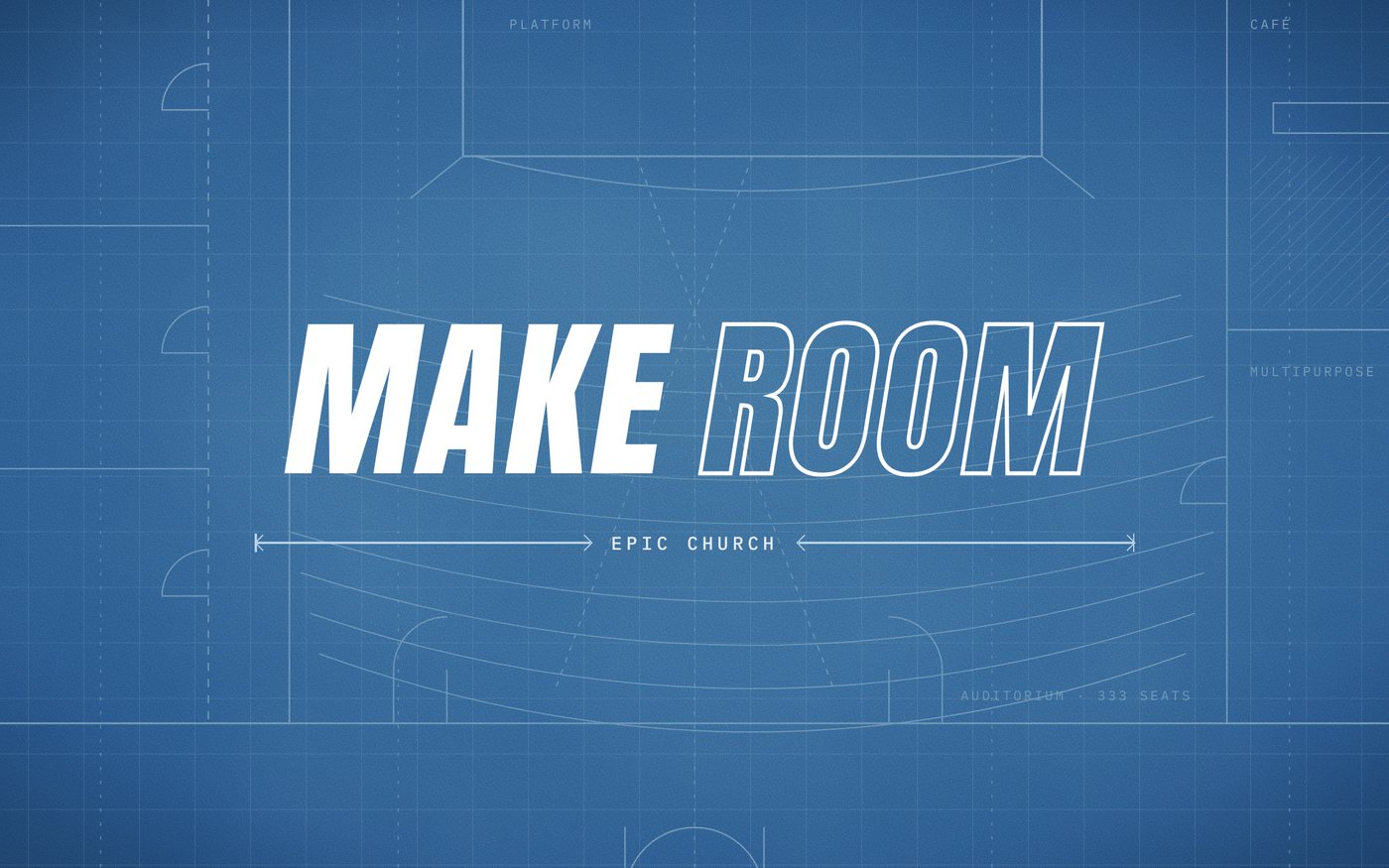
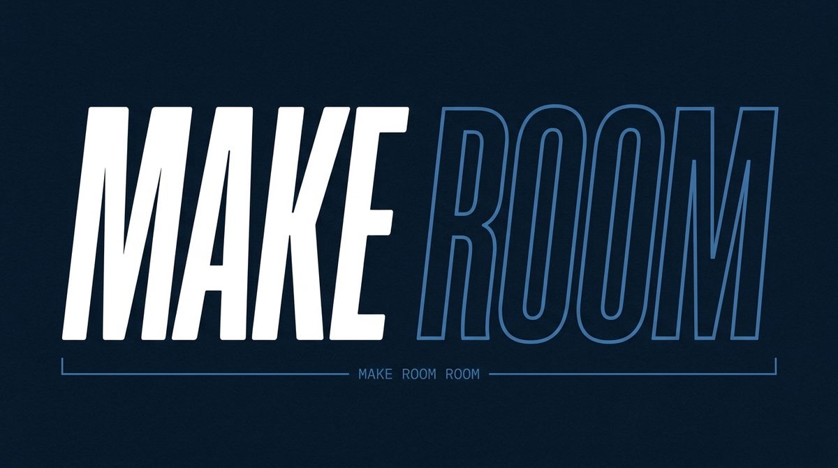
The team asked for the lockup as the centrepiece over two grounds: the blueprint itself, and a textured blueprint-blue gradient. Round 2 answered with five backgrounds. Round 3 deliberately left the drawing behind and put people on the ground instead, so the campaign would not argue only from the building's side. Round 4 built four title slides from the client's own reference styles. The client picked MR-A04, the textured radial gradient with the plan ghosted behind the mark.

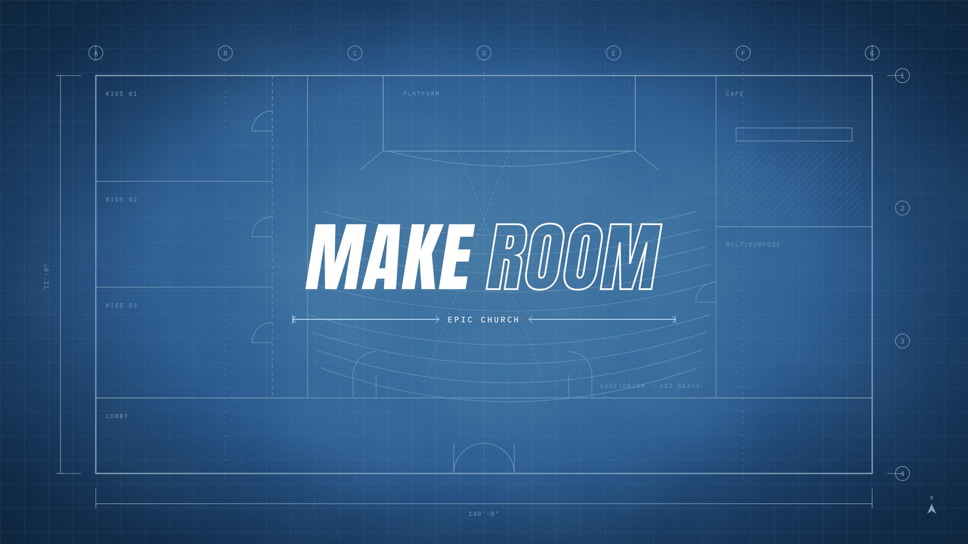
MR-A04 Rev B: the MAKE ROOM lockup over the blueprint field with the Phase 01 plan
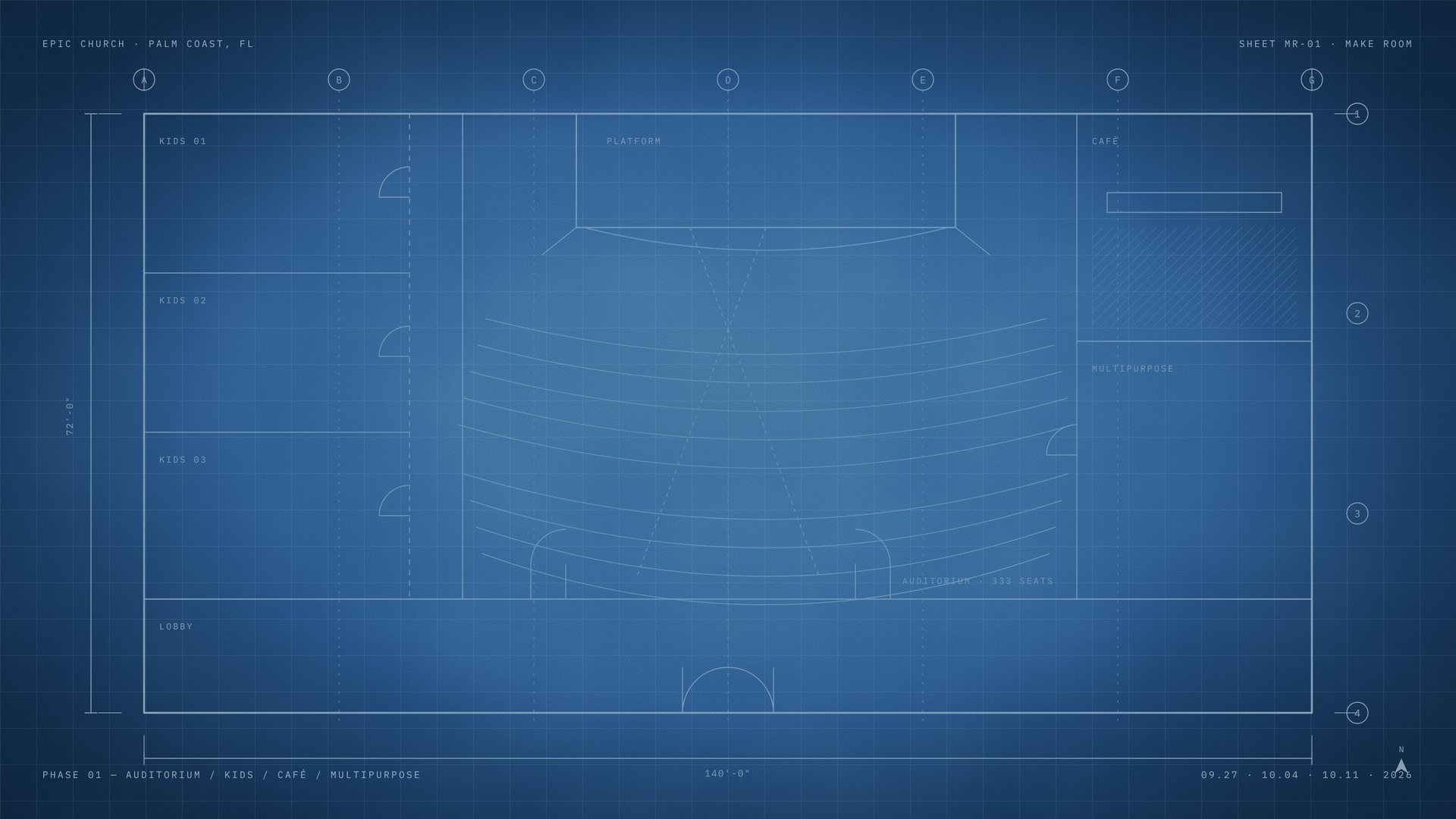
MR-A04, Rev B. The field is an elliptical radial lit from the centre, grain 9, with the Phase 01 plan drawn as live vector: platform and stage lip, nine fanned rows, two radial aisles, lobby, three kids rooms off a corridor, the café counter, column grid A–G / 1–4, 140'-0" × 72'-0". The plan fades to 28% behind the lockup so lyrics and lower thirds stay legible.
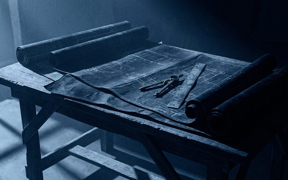
The series background with the centre left clear, and the grounds explored on the way to it: a drawn plan full bleed, cyanotype paper, rolled sheets, and the room itself.
[ ROUND 5 · THE LAYER KIT ]

Deconstructed into six layers the client opens in Canva.

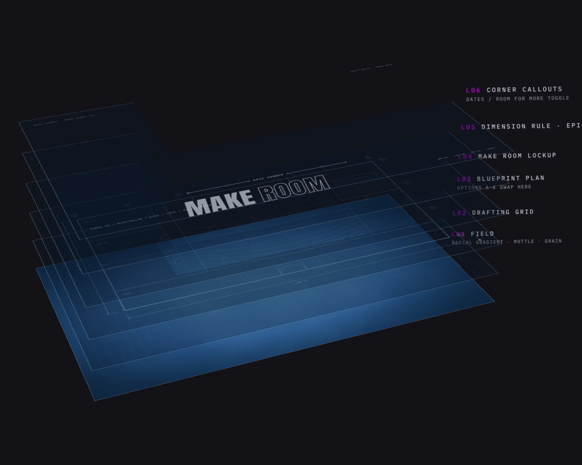
Four client notes came back: bring the plan out, drop the dates and the sub-line, move the dimension rule a touch lower, swap ROOM FOR MORE for EPIC CHURCH. We applied them and rebuilt the graphic as a registered stack at 3840 × 2160, every layer a full-frame PNG and SVG with no masks or filters, so it survives import into Canva and PowerPoint as separate named objects.
L01FieldRadial gradient sampled from the approved render, mottle and grain baked in
L02Drafting grid
L03Blueprint planFive swap-in options A–E; the client narrowed to D (oversized seat fan) and E (whisper)
L04MAKE ROOM lockup
L05Dimension rule · EPIC CHURCH
L06Corner calloutsDates, or ROOM FOR MORE, on their own toggle
Exploded view of the six registered layers: field, grid, plan, lockup, rule, callouts
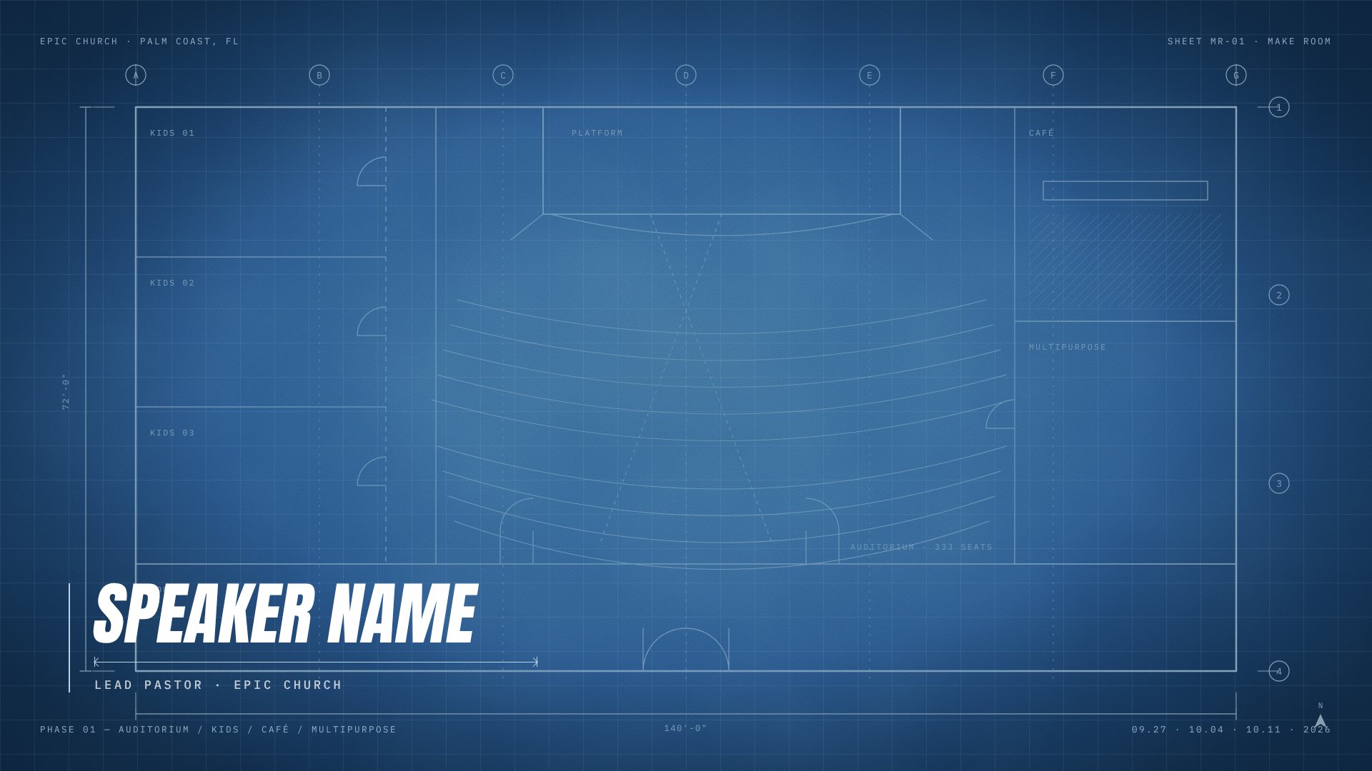
Lower third L07, title block style, over the series background
Lower third L08, open style, over the series background
Blueprint option D: the oversized seat fan bleeding off the frame
The two lower-third styles, L07 title block and L08 open, with live name and title boxes; and blueprint option D, the oversized seat fan the client shortlisted. Wide 3:1 and roll-up 2:5 banners shipped the same way, each as a layered PPTX at its own slide size.
04THE TREATMENT // PHOTOGRAPHY

A true duotone, not a filter.

Every photograph in the blue world goes through the same three-stop grade: flatten to luminance, autocontrast, then remap through a LUT that lands shadows in Blueprint Navy and highlights in Line Blue. That is why the baptism stills, the architect's renders and the generated plates all read as one campaign, and why they still read as photographs.
The rule that makes the edit is the same one that makes the stills: the duotone is the plan, full colour is the people. The moment a face fills the frame, colour comes back. That single switch does the work of a voiceover.
#08192B
#0F3157
#437AAD
#B9D3E7
near white
The ramp, shipped as MAKEROOM_duotone-blue.cube so the church can drop it on any footage they shoot next.
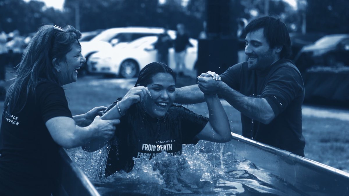
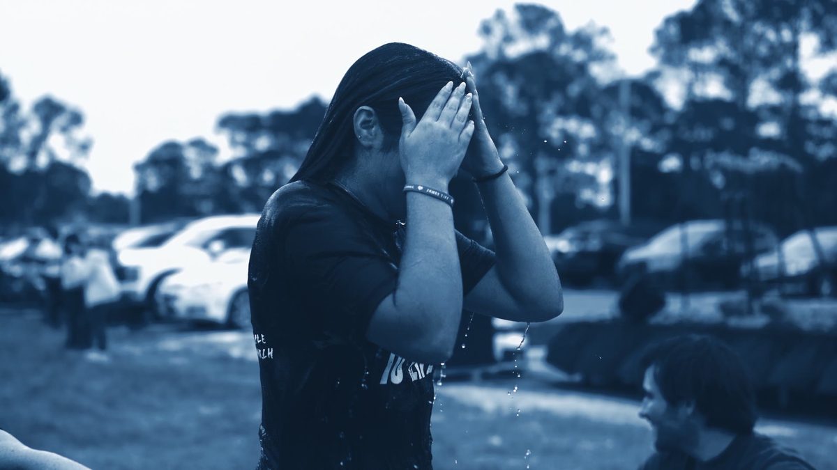
A baptism from Epic's own photography, graded through the blueprint duotone
One of Epic's own baptism stills after the grade. The water stays, the parking lot goes.
[ BAPTISM DAY ]

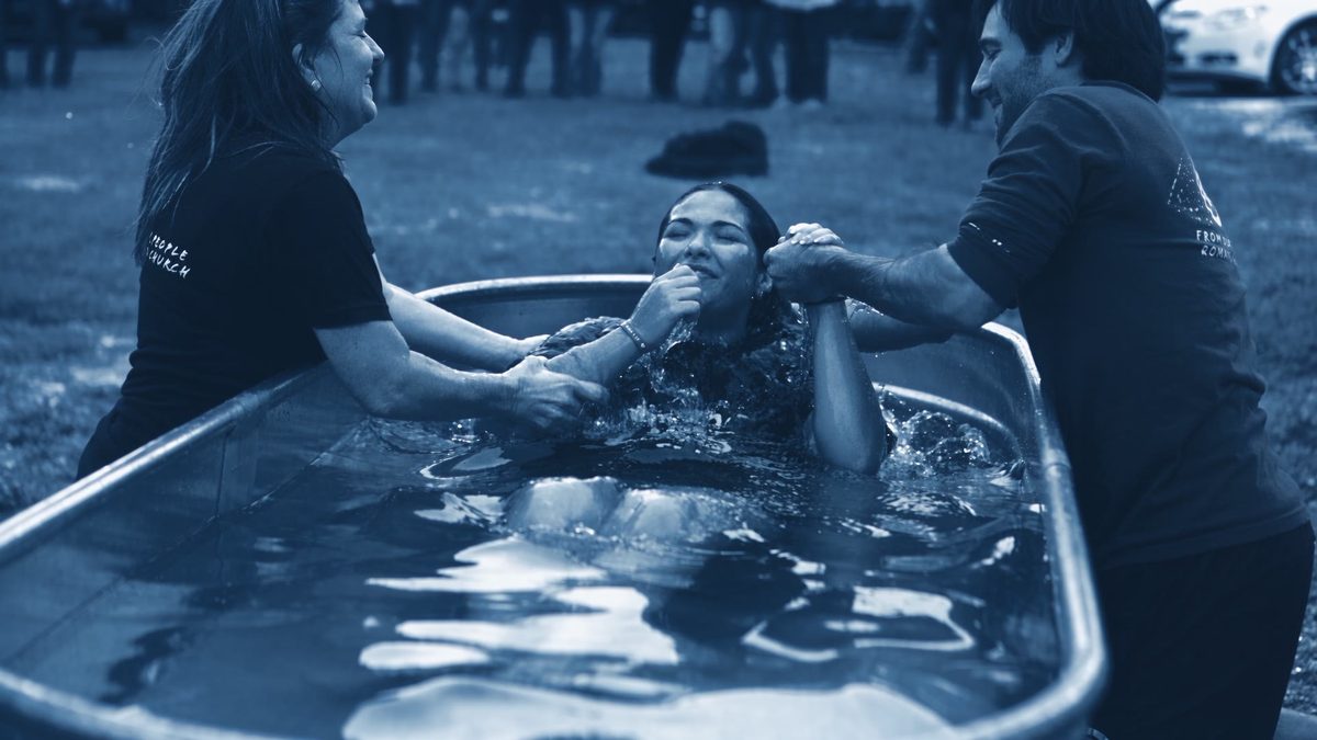
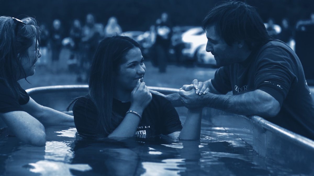
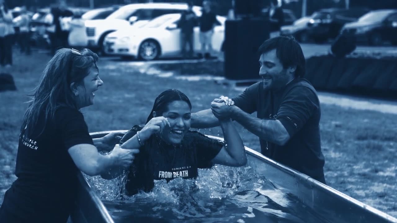
Twenty-four stills from one stock-tank baptism. Busy parking lot behind every one.

The church's real photography was shallow-depth and warm, shot against cars and trees. To put people on the blueprint field we needed them cut out, and a torso floating over a drafting grid looks like a mistake. So the cut-outs keep the water: a people mask from rembg, unioned with a near-depth band from Depth Anything, feathered 14 px, drops the cars and trees and keeps the tank. Seventeen stills, four layers each.

Baptism still, duotone, hands to faceStill · graded
Baptism still, duotone, in the tankWater kept
Baptism still, duotone, coming upForeground
Frozen diorama move on a baptism stillParallax · 12 s
Graded stills from the set, and the frozen-diorama move built on one of them. Each still ships in four layers: full duotone, soft background plate, foreground people and water, people only. Parallax in the bumper is the background at 1.03 → 1.065 against the foreground drifting the other way.
Drone frame of the cleared and graded site, blue duotoneSite · drone
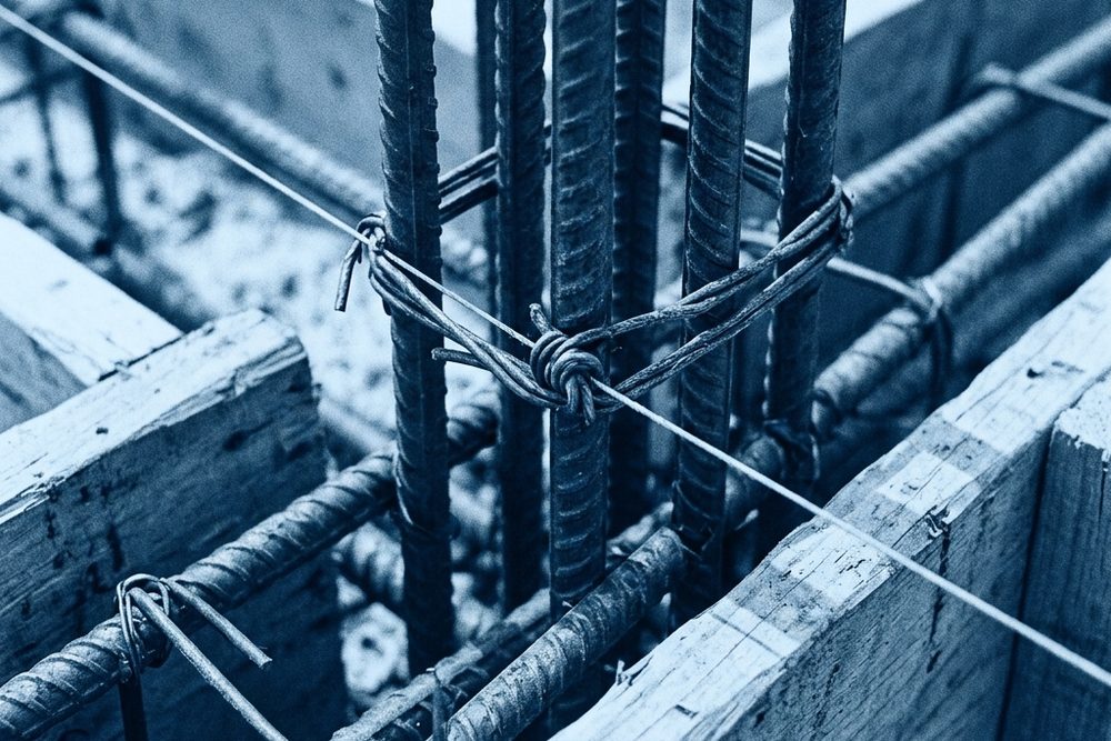
Rebar macro, blue duotoneSite · rebar
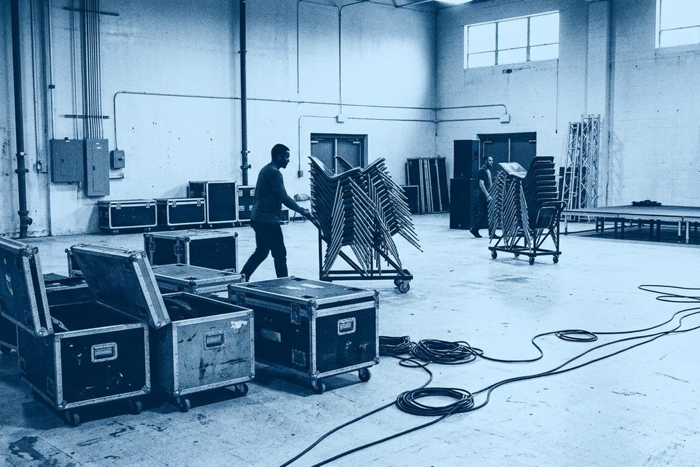
Road cases at load-out, blue duotonePortable · load-out
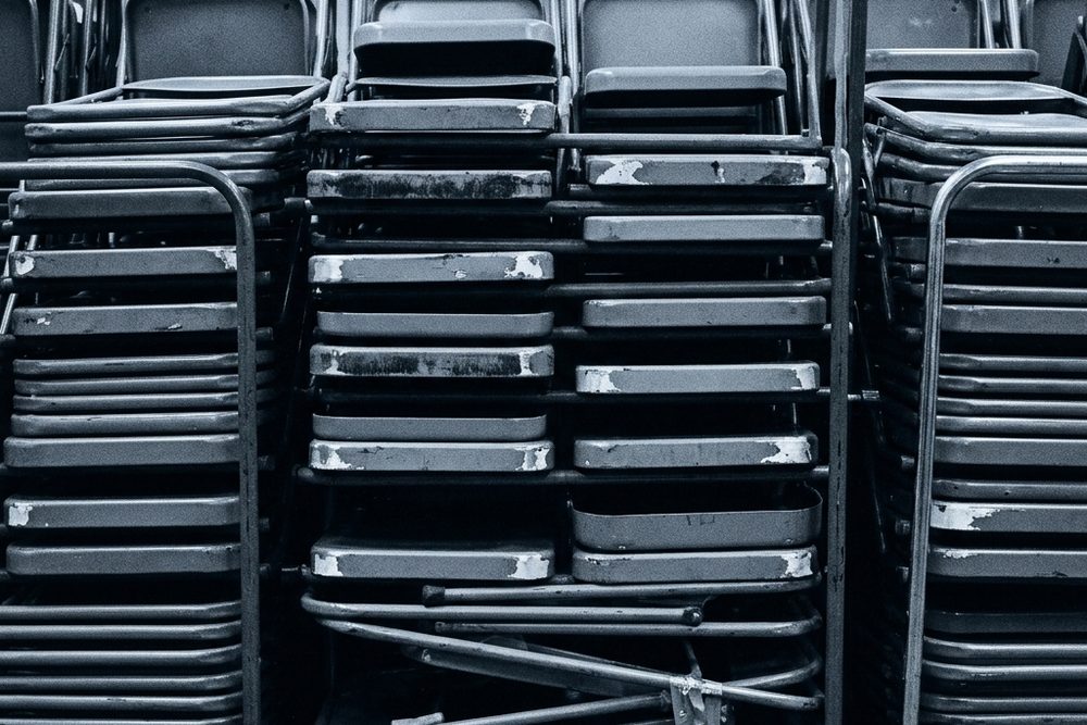
Stacked folding chairs, blue duotonePortable · chairs
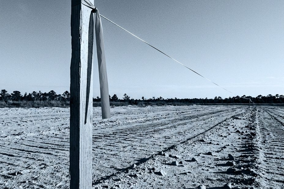
Survey stake with flagging tapeSite · stake
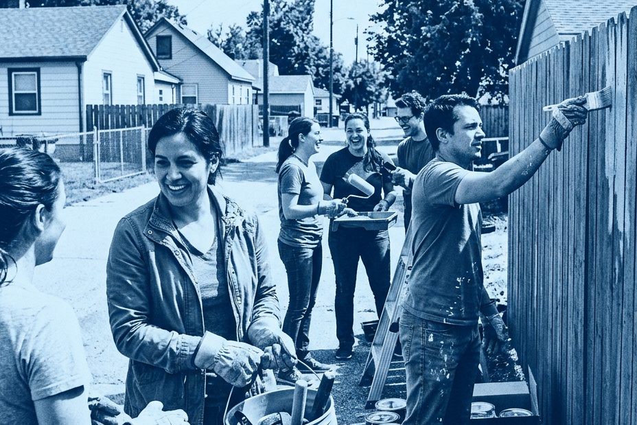
3G local missions Sunday, blue duotonePeople · 3G
Teen coming out of the water, full colourPeople · colour breaks through
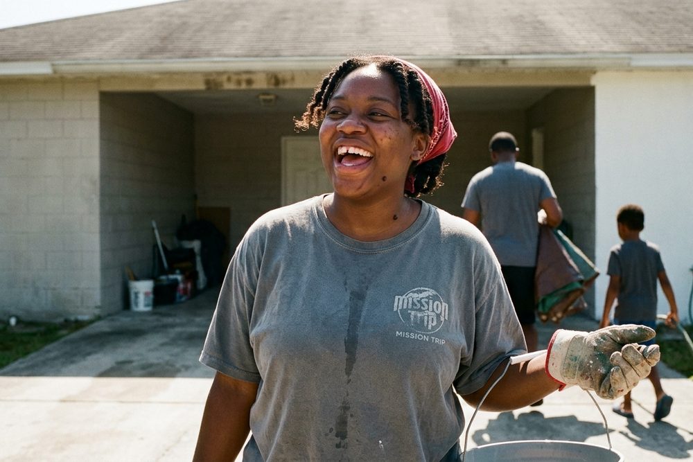
Woman laughing at a driveway service day, full colourPeople · colour
[ ROUND 4 · TITLE SLIDES ]

Four reference styles. Each delivered twice.

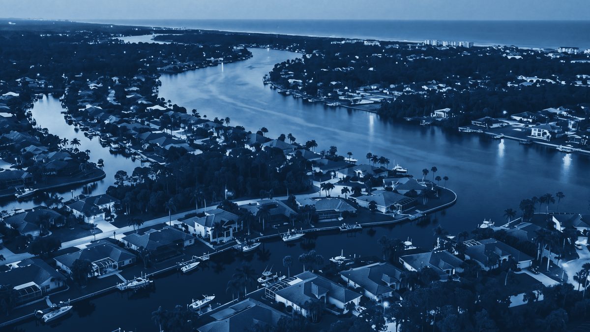
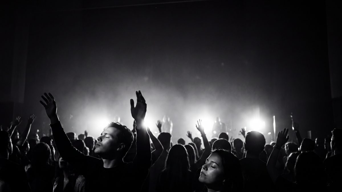
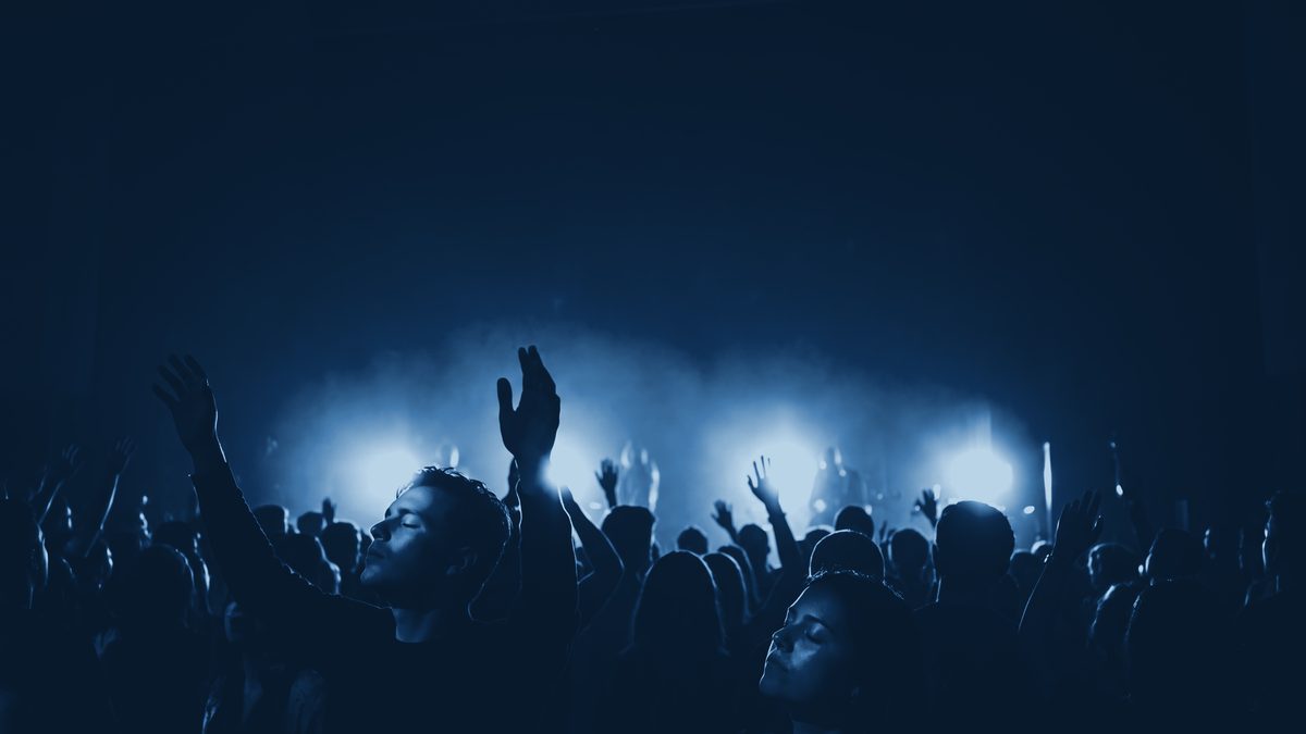
The client sent four slides they liked from other series and asked for the same photo styles under the Make Room mark. We built all four, in their native colour and in the blueprint grade, so the decision was about the treatment and not the picture. The Palm Coast knockout stacks MAKE over ROOM: on one line the letters are too shallow to hold a photograph.

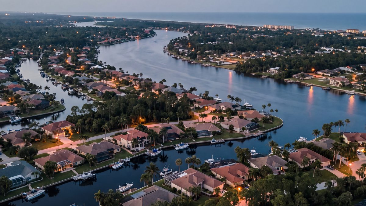
Palm Coast aerial at blue hour, native colourPalm Coast · native
Palm Coast aerial, blueprint duotonePalm Coast · blueprint
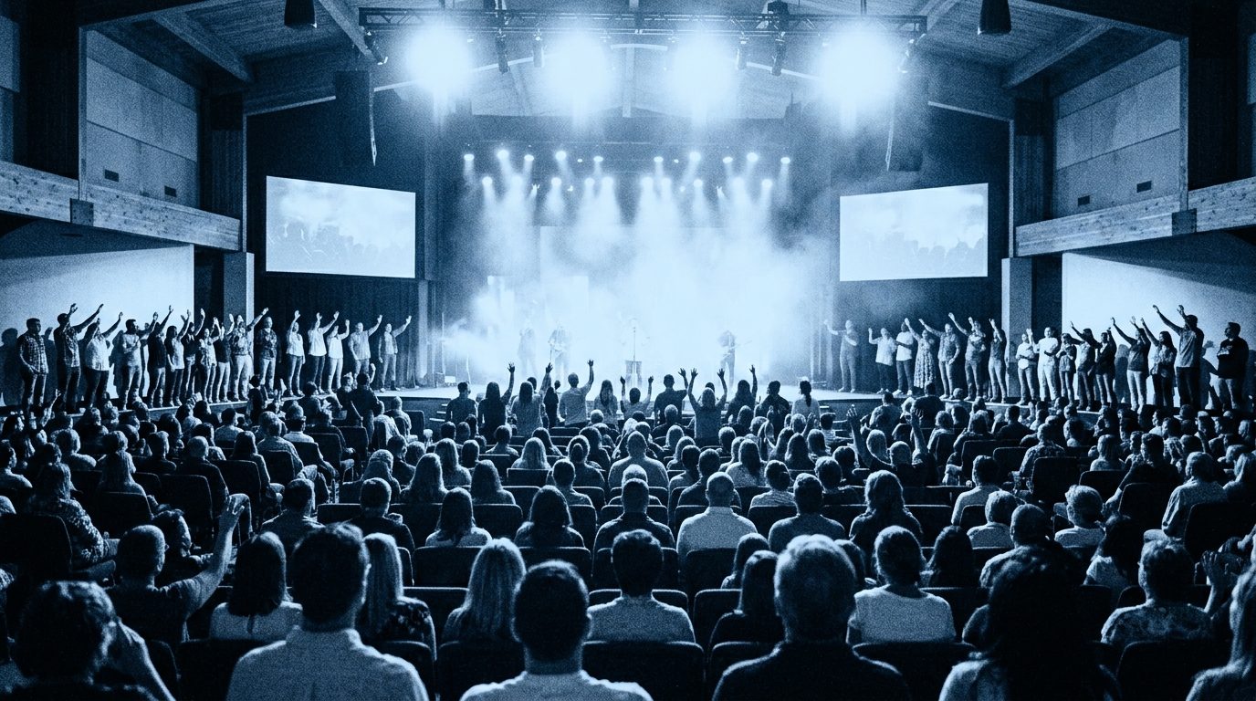
Worship crowd with hands raised, black and whiteThe room, full · native
Worship crowd, blueprint duotoneThe room, full · blueprint
Plates generated in Higgsfield for the review round; every composition takes a straight swap for Epic's own room, congregation and drone frame with no redesign.
05MERCH // SIX TEE ROUTES

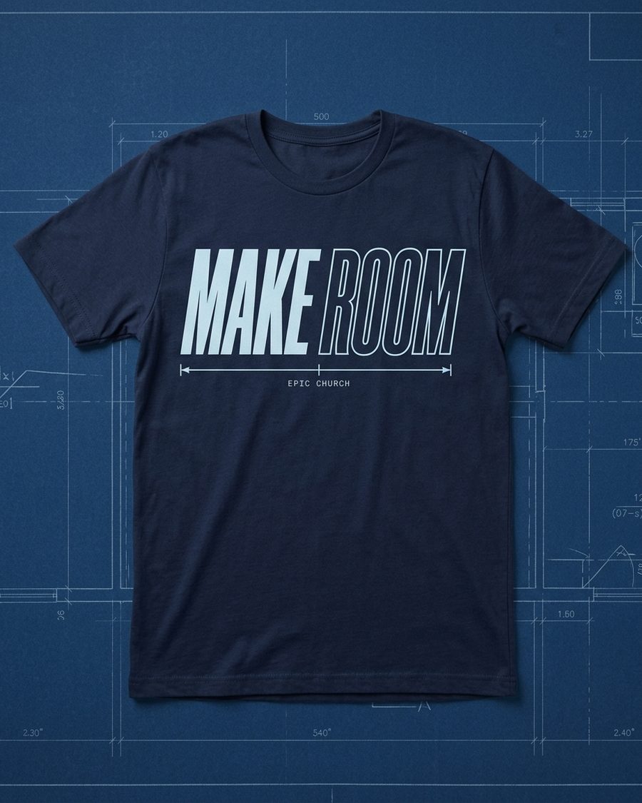
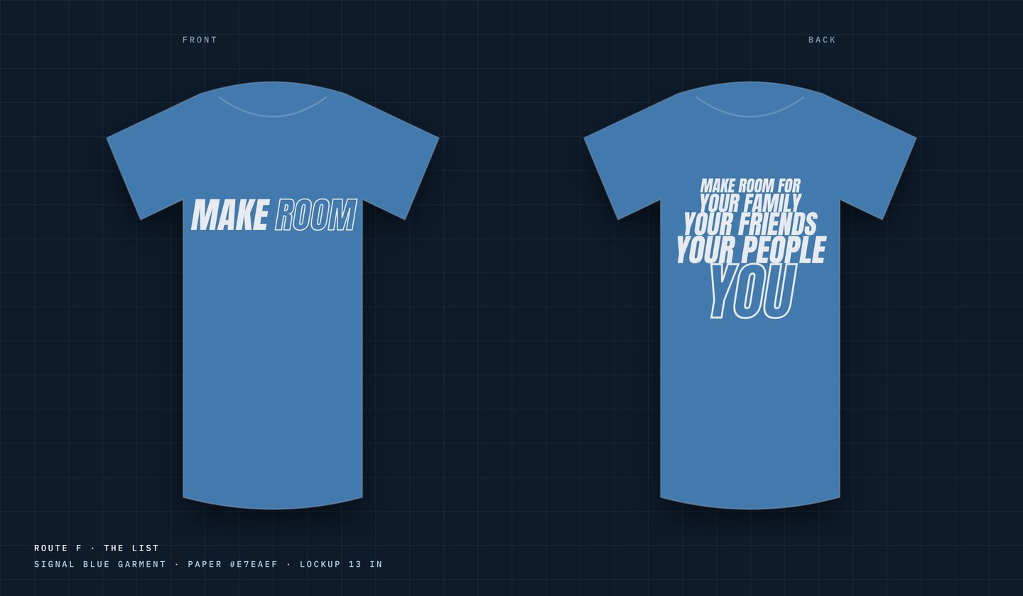
Front: the lockup, centred, measured, not stretched. Back: six ways of saying it.

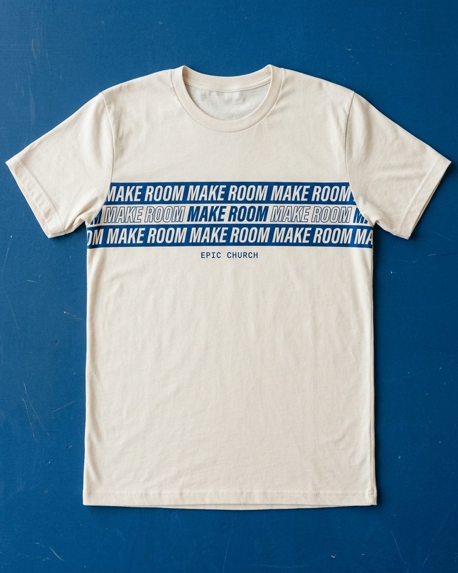
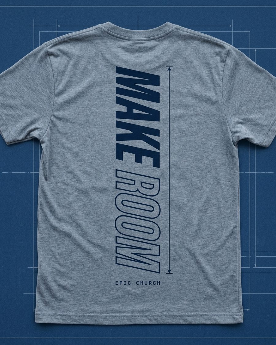
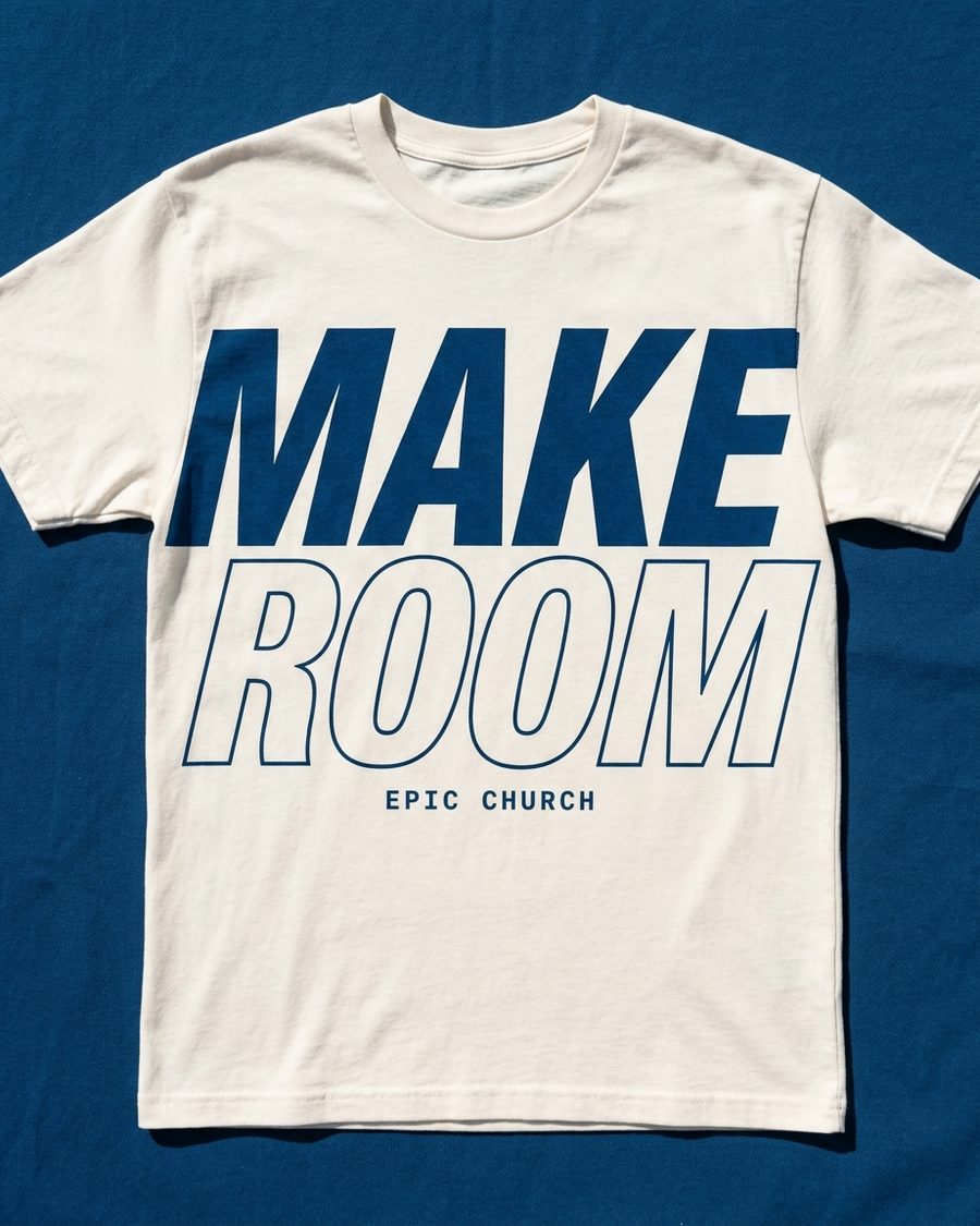
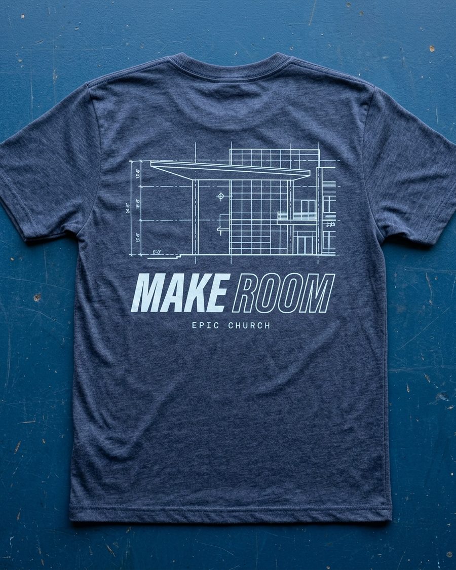
The series graphic gates the tee and the commitment card, both of which need lead time to order, so merch arrived in the same round as the graphic. Every front is the lockup on the chest at true proportion with a real print width a printer can quote from. The backs are not six sentences; they are six different ways of making the ask.

Navy tee with the MAKE ROOM lockup on the chest
Bone tee with the single-line MAKE ROOM yoke band
Heather tee with MAKE ROOM running down the spine between dimension ticks
Cream tee with the stacked MAKE ROOM lockup
Back print with the Phase 01 elevation drawn above the lockup
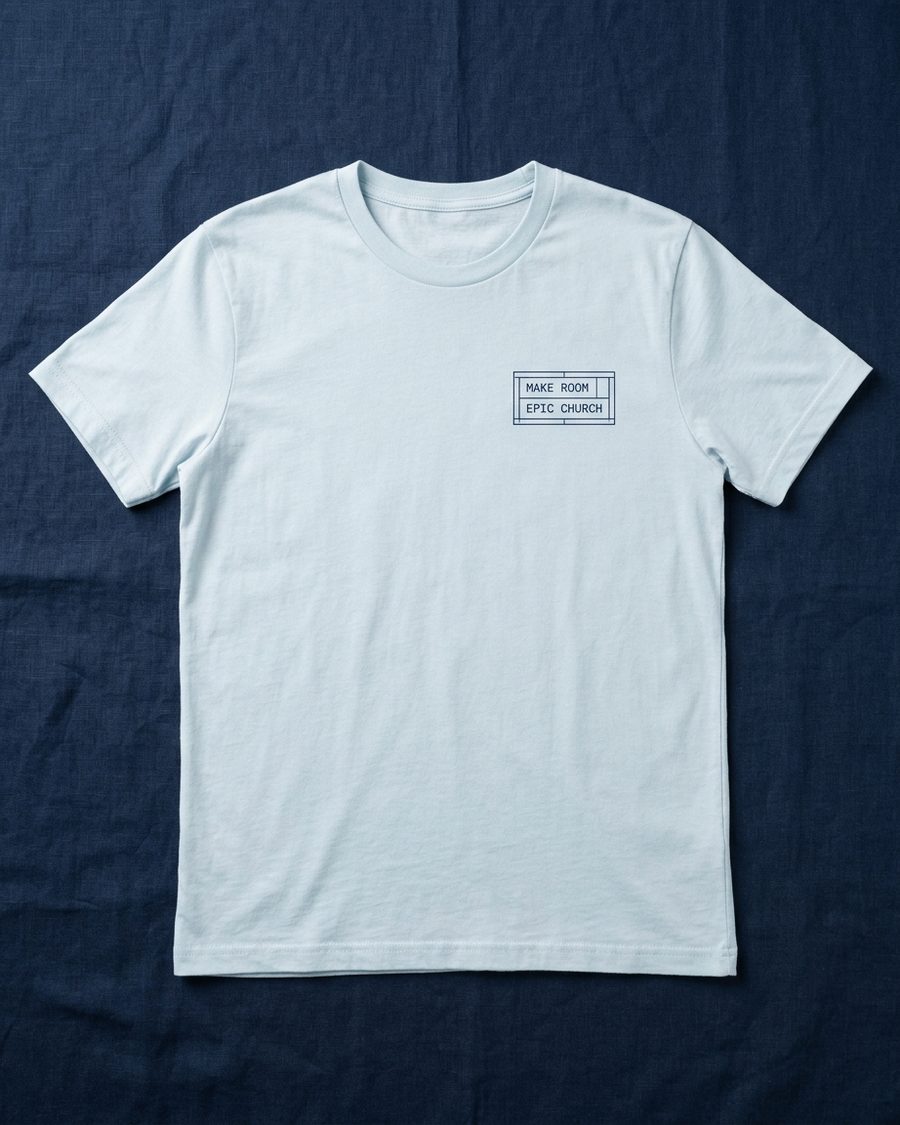
Pale blue tee with a small boxed MAKE ROOM pocket mark
A · Center chest
Navy, one colour. MAKING / ROOM / FOR YOU stacked on the back. Launch Sunday.
B · One colour
Bone garment, signal blue ink. A single-line yoke band. The volunteer shirt still in rotation a year later.
C · The blank
Pale blue, navy ink. The write-on rule on the front: make room FOR ______.
D · Save you a seat
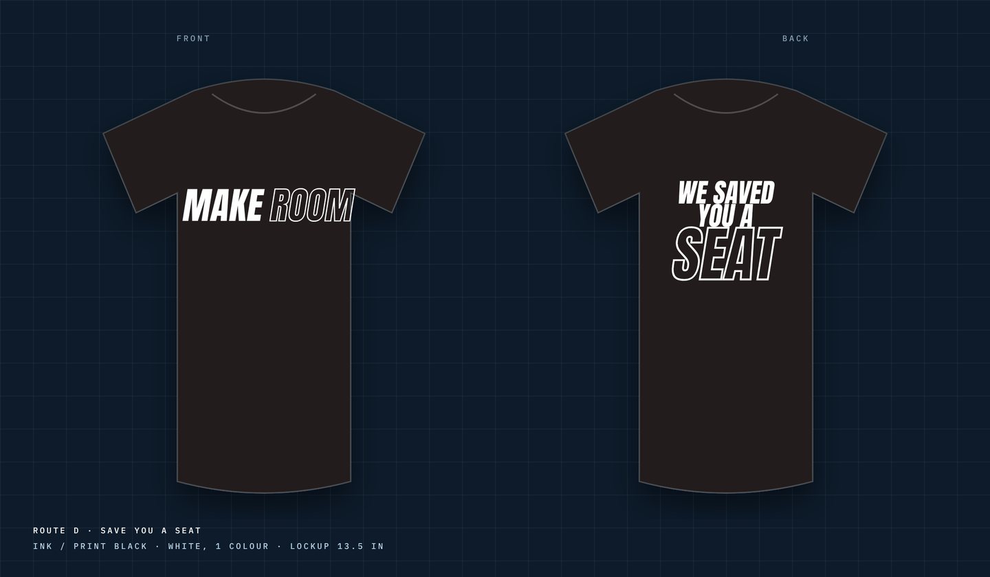
WE SAVED / YOU A / SEAT, SEAT outlined and largest. The warm, everybody-wears-it option.
E · Down the spine
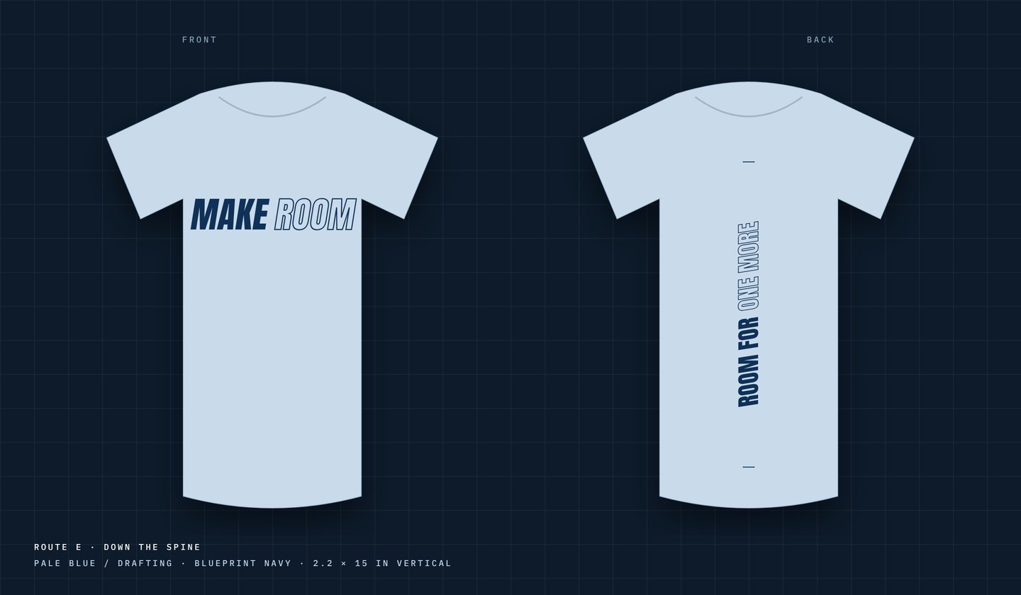
ROOM FOR ONE MORE set vertically between two dimension ticks. Reads from behind, in a crowd.
F · The list
Your family / your friends / your people / YOU. Each answer wider than the last.
Route D flat, front and back: WE SAVED YOU A SEAT
Route E flat, front and back: ROOM FOR ONE MORE down the spine
Route F flat, front and back: the list ending in YOU
Routes D, E and F as production flats, front and back, drawn to garment scale with the print width on the sheet.
[ COMMITMENT CARD ]

The blank is the mark. The mark is the card.

Nothing decorative gets added to the commitment card, because the logo already contains the thing you are asked to do. The dimension line becomes the write-on rule. Delivered as a layered Photoshop template at 300 DPI alongside the tee placement guide.

Commitment card · Epic Church · Phase 01
MAKEROOM
for
name
06THE SONG // “MAKE ROOM”

A self-titled track, and a grid to cut to.

The campaign got its own song, written and produced by the Mission Creative team. “Make Room” runs 1:22 at 98 BPM: fourteen seconds of pad, vocals in, a lift at 0:29, a dip, and a drop at 0:55.9 that the whole bumper is built around. We measured the track before cutting a frame. Bar zero lands at 14.255 s and every bar after is 2.449 s, so every cut in the film sits on the grid: bar(n) = 14.255 + 2.449·n.

For every heart still searching… for Palm Coast, for the one.
You are doing something new. For every heart that's yet to come. It's time, now, to make room.Pre-chorus and chorus · “Make Room” · produced by the Mission Creative team
PAD VOCALS IN · BAR 0 LIFT · BAR 6 DIP DROP · BAR 17 TAIL 0:00 0:15 0:30 0:45 1:00 1:15 1:22 CUT FADES 1:05–1:10 TICKS = BARS · bar(n) = 14.255 + 2.449·n · 98 BPM
1:22 runtime98 BPM0.612 s beat2.449 s bar55.89 s the drop · bar 171:10 cut length, tail faded
07THE BUMPER // OUT OF THE WATER

One minute ten. Only real assets. No text on screen but the mark.

The series intro had to be built from what the church actually had: twenty-four baptism stills, one handheld recap video, four building renders and the track. No worship footage existed, so celebration shots stand in. Two directions were storyboarded, Out of the Water and Every Seat Has a Name; the first became the spine, the second's photo-in-a-drafted-box look became the opening, and its lockup-over-blueprint-and-squares frame became the ending. The dark empty auditorium was cut on sight.

Asset kit · frozen diorama · 12 s
One of the parallax beats: a baptism still, frozen, with the camera floating through itasset kit · 05-Video-clips-graded
[ THE CUT · ON THE GRID ]
0:00 – 0:14Field fades up. Grain, slowed water texture on screen blend, then the whisper of the drafting surface.
0:14 – 0:29Four rooms. A frame draws on, a photo fades in, the people lean past the frame.
0:29 – 0:48Build. Full-frame parallax stills alternating with slowed clips, double exposures, half-bar cuts; seat-fan lines creep in from bar 11.
0:48 – 0:51Seat grid. Faces land four per eighth-note, open boxes draw in.
0:51 – 0:55The hold. One woman under the water at 35% speed. Seat rows draw left to right.
0:55.9 · DROPShe breaks the surface framed low and the fist goes up under the lockup. The rule draws out from centre.
1:00 – 1:03Forward recall on every beat under the lockup. No reversed footage: reversed baptisms read as people going back under.
1:03 – 1:10Ending. Field, grid, seat fan, photo squares popping in on the beats with a little parallax. The lockup holds. Fade.
[ STYLE FRAMES ]
Style frame: the hold, one woman under the waterThe hold
Style frame 2D: lockup centred over blueprint and photo squares2D · the ending
The room, full: the frame that was argued out of the endingRejected · dark room
Seat fan drawing in under the lockupSeat fan · bar 11
The hold, the 2D ending with its photo squares, the seat fan that draws in at bar 11, and the dark room that was argued out of the cut.
What was handed over

A rendered rough cut, and a layered asset kit built from the full-resolution originals at 4000 px: seventeen stills in four layers, seventeen face squares, three room frames and a 12 × 5 seat grid as transparent 4K overlays, the LUT, and ten trimmed graded clips with the hero shot at native and 40% speed. So the church can finish it in their own edit, add the lyric text themselves, and re-use every piece on Sunday.

08THE BUILDING // RENDERS IN MOTION

A frozen diorama you float through.

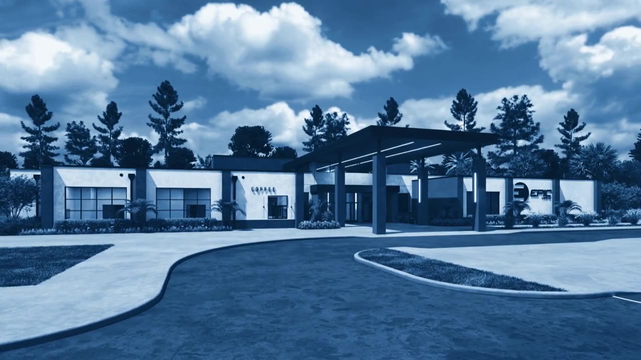
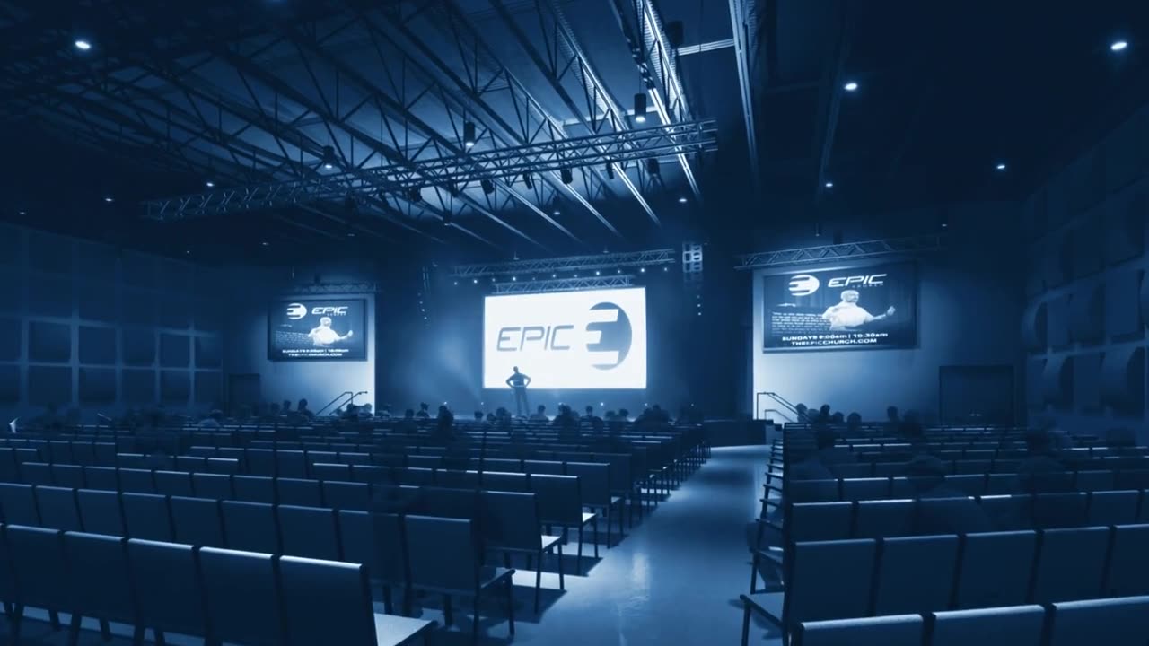
The architect's four renders came with white borders, rounded corners and a watermark. We cropped them to clean 16:9, inpainted the watermark out, lifted the auditorium so it stopped reading as a dark room, and ran them through the same duotone as the baptism stills. Then each became a twelve-second flythrough: one continuous floating handheld move, the scene frozen like a diorama, dust and lens bokeh, the blue held. The brief specified Seedance 2.5; at 144 credits a clip the client chose Kling 3.0 Pro at 18, and the duotone held in every take.

Exterior · Kling 3.0 · 12 s
The entrance canopyduotone held
Auditorium · Kling 3.0 · 12 s
Auditorium, lifted so it stops reading as a dark roomfrozen diorama
Kids room · Kling 3.0 · 12 s
Kids environment, watermark inpainted outfrozen diorama
Auditorium, full · Kling 3.0 · 12 s
The room with people in it, generated to fill the gapslow motion
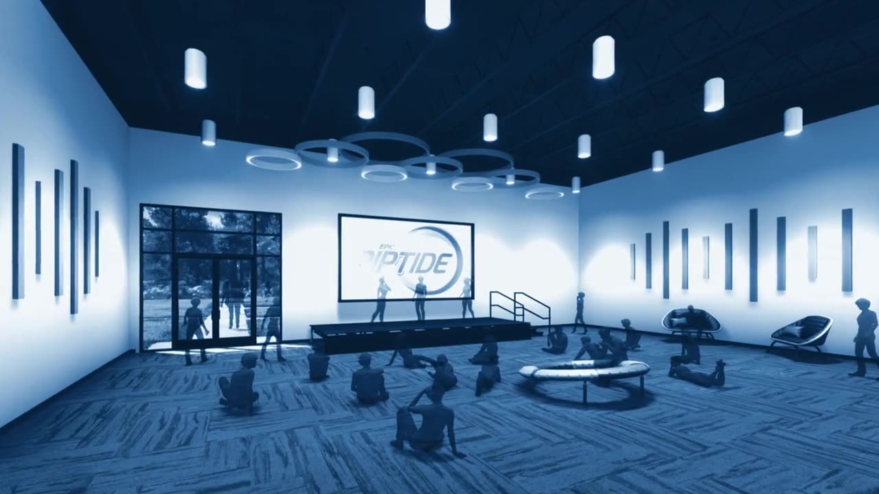
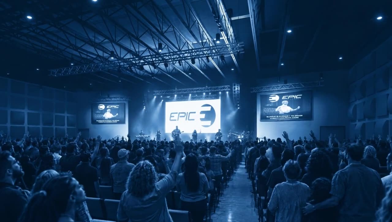
Exterior, auditorium, kids room, and the auditorium again with a full room and a band on stage, generated to fill the one gap in the church's footage. Those people are not Epic's congregation, and the kit says so.
09MOTION // THREE 20-SECOND LOGO BUILDS

The lettering had to stay pixel-exact. So the SVG animated itself.

Generative video redraws type and linework. For the logo builds we animated the Round 5 SVG layers directly in a headless browser, stroke by stroke, with deterministic timing, captured every frame with transparency and composited over the field in code. Three masters, 1920 × 1080, silent, ending on the approved frame.

Build A end frame: the approved MR-A04 frameA · Full build · end frame
Build B end frame: 333 chairs on the seat fanB · Chairs · end frame
Build C end frame: faces and squares around the lockupC · Faces + squares · end frame
A
Full build. The gradient blooms, the grid sweeps on, the plan draws group by group, then MAKE wipes along the 9° italic and ROOM outlines draw per letter.
B
Chairs. All 333 seats land one at a time, serpentine row by row out from the platform, slow at first and then a rush. Each draws its outline, overshoots, flashes and settles.
C
Faces and squares. A lifted-black duotone with a baptism photo drifting under the field. Thirty-four squares pop in, half faces, half close-ups; twenty-two stay empty. ROOM draws slowly through the whole build; MAKE lands for the reveal.
A note from the client, and a rule we kept

The first versions brightened the whole frame at the reveal and shifted the blue. Version two removed every glow, flash and halo from the compositor; the field is untouched from 3.6 seconds to the end, measured pixel by pixel. And the small type came off build A. Rule for every motion piece since: no small type in motion unless asked.

10THE HANDOVER // WHAT THE CHURCH KEEPS

Built so a volunteer can open it on Tuesday.

Everything ships in the formats the church actually uses. Layers, not flats. PowerPoint decks that import into Canva with every element intact. A one-slide brand guide built on the campaign's own field. A LUT. A quick guide written for whoever is making something for the campaign next.

Identity
Brand strategy + guide

Manifesto, seven visual laws, Visual DNA lock, the one-slide MR-BG-01 guide with every hex in the notes.

Series graphic
Rev B layer kit

L01–L06 as PNG + SVG at 4K, hero and series-background flats, five blueprint options, three Canva-ready PPTX decks.

Screen
Lower thirds + banners

Two lower-third styles with live text boxes; 3:1 wide banner and 2:5 roll-up, layered.

Print
Card + tee templates

Commitment card PSD at 300 DPI, tee placement guide at 150 DPI, six tee routes front and back.

Film
Bumper rough cut + asset kit

1:10 render, seventeen layered stills, overlays, graded clips, the LUT.

Motion
Three logo builds

Full build, chairs, faces and squares. 20 s masters, 1080p, silent.

Renders
Cleaned stills + flythroughs

Four renders in colour and duotone, five 12-second Kling flythroughs.

Voice
Quick guide

The idea in one paragraph, the colour rule, what to do and what not to do, for whoever picks it up next.

ClaudeHiggsfield · Nano Banana · Kling 3.0 · SeedanceGPT ImageCanvaPhotoshopPlaywright + Chromiumrembg + Depth AnythingffmpegIn-house, all of it
[ WHAT THIS WAS REALLY ABOUT ]

We're not designing a building. We're making room.

A capital campaign identity has to do three jobs at once: convince the leadership table, move the congregation, and survive a volunteer with Canva on a Tuesday. This is how one system did all three.

[ Unify ]
Treat the client's ideas as one system.

Three starting ideas became one mark, one texture and one emotional thread, instead of three competing comps.

[ Stress-test ]
Build the opposite before you commit.

Two full counter-directions made the choice a strategic one. The chosen route got stronger for having been argued against.

[ Lock the mark first ]
Everything downstream depends on its geometry.

Mark, then sermon variants, then texture, then film. The logo animation only works because the lockup was final.

[ One rule ]
Blue is the drawing. Colour is the people.

A single switch that tells the story in a still, a slide and an edit, and that a volunteer can apply without a meeting.

[ Honesty ]
Real over generated.

Generated plates filled gaps for review rounds and were labelled as such. The church's own baptism, missions and drone footage goes to print.

[ Hand it over ]
Layers, decks, a LUT, a guide.

The work is only finished when the client can open it, change it and keep using it after we leave.

Got a campaign that needs
more than a logo?

Your vision. Our mission. Strategy, identity, film and the kit to keep it going.

Get In Touch

Fill out the form and we'll respond within 24 hours

Available now
✕